Android Jetpack Compose Basic Tutorial
On 2021/7/28
Google officially released Jetpack Compose stable version 1.0
If you are interested in the official announcement, you can check here
Today, I plan to share some basics on how to use Jetpack Compose to create components for Android apps.
Jetpack Compose is entirely written in Kotlin code
replacing the traditional .xml files used for views or layouts
resulting in only .kt files
which reduces the majority of XML files.
Some basic concepts of Kotlin
So if you are already familiar with the above Kotlin concepts
you will have a significant advantage in learning Jetpack Compose
and can quickly get started.
Here is a simple toolbar written in XML:
And here is the toolbar written in Jetpack Compose:
This change allows us to control views entirely with code.
At the same time,
it makes it more convenient to use variables of function types,
to control the functionality needed for the views.
Since we are implementing with pure Kotlin code,
we can more flexibly use conditionals to control the visibility of views.
This gives us greater flexibility when designing applications.
Here,
I have created some basic widgets.
When you actually use them in an Activity or Fragment,
you can reuse them as needed,
which allows for more efficient development and management of your application.
This modular design approach enables you to quickly build feature-rich and reusable interface elements,
greatly saving development time and improving code maintainability.
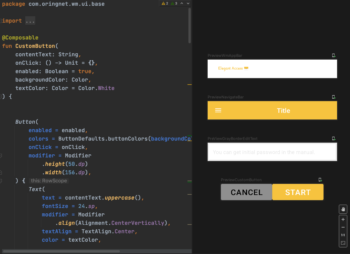
The final result in the IDE preview might look like this
Code on the left and preview on the right
You must update Android Studio to the Arctic Fox version
to preview Composable components through the IDE.
Official download location:
Download Android Studio Arctic Fox
First, add the relevant libraries to the gradle dependencies:
Add @Composable to indicate that your function is a Jetpack Compose component.
Here,
Modifier
is an interface frequently used in Jetpack Compose,
to extend the properties of components.
Here,
using a variable as a function parameter,
means that when you call the AppBar component,
you can customize the Modifier,
setting properties such as the background color, animation, font, etc.
(Depending on the official component you are using, set different contents according to the implementation of that component's Modifier.)
You can use Column to arrange the views you create with Jetpack Compose.
Column provides a vertical arrangement similar to LinearLayout,
which is very useful when you need to add multiple components.
By using Column, you can easily arrange multiple components vertically,
making your interface layout more structured and easier to manage.
—
Start adding functions built into the official library to quickly create a toolbar.
For example, TopAppBar
Here you will see some
modifier = ... ,
backgroundColor = ...,
elevation = ...,
contentColor = ...,
This actually utilizes Kotlin features like Named arguments and function types,
allowing you to more effectively extend the code when using functions.
Additionally, here we can use a function type variable
content: @Composable RowScope.() -> Unit
to add an Image to the left side of the TopAppBar:
(You can press cmd+left click here to see the source code of TopAppBar and understand what RowScope does)
At this point, you have quickly completed a simple, extensible, and reusable widget.
So how do you start the preview? You just need to write another function and add @Preview Then press refresh to see the view you just created displayed on the right side of the IDE. (If you don’t see it, you can click Design or split on the right to open the preview screen)
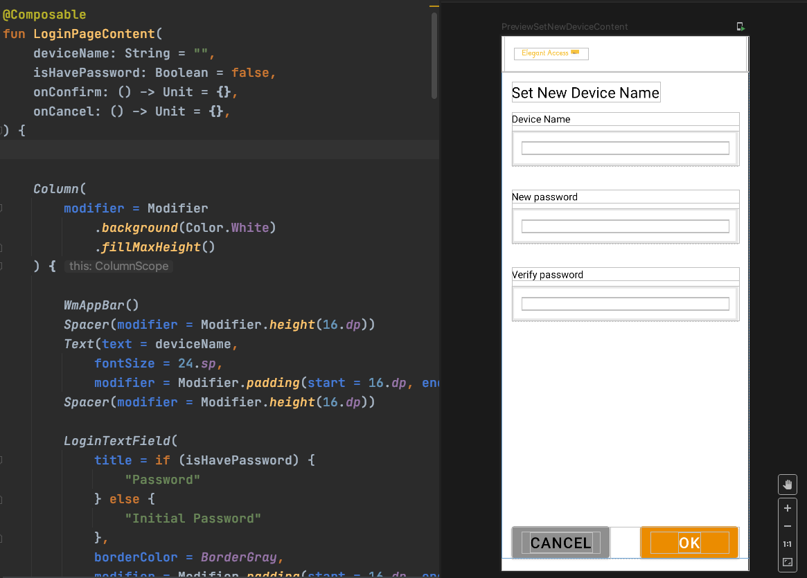
In practical application
You can wrap it into a content to call it
This way, your screen can be divided very finely
Future maintenance will be more efficient
For example, wrap a complete logic layout like this
This way, if you want to change the layout appearance in the future, you can change it here
Some functions of your basic components do not need to be specially modified
Actual result:
After completing the above steps
You can set your layout in the fragment or activity
Quite concise