Learning Android Kotlin Custom UI Techniques - Swipe View and Dropdown Animation Tutorial - 03
Hello, everyone, this is KC from Elegant Access,
Welcome back to the customization implementation series,
Today’s content will cover how to implement a horizontally swiping recycler view, and how to adjust it,
to make it feel like a pager swipe and adjust the spacing between items. Alright, without further ado, let’s dive in!
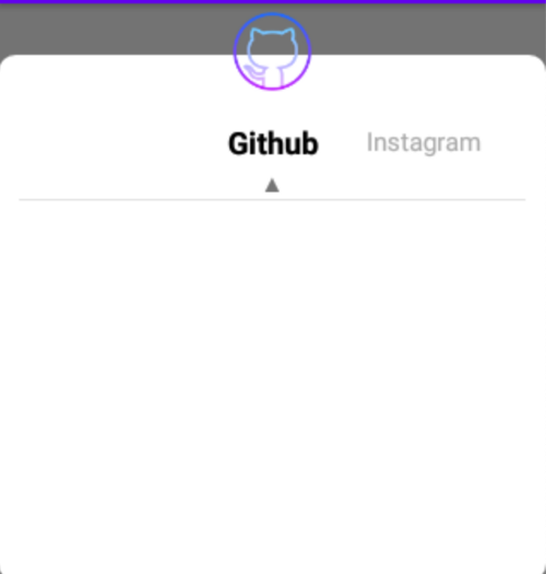
Effect picture:
The first step is very simple, you need to define an adapter for the recycler view. Here, I prefer to start by creating the XML for the item, as shown below:
Next, start defining your adapter and load the item you just created into it:
Since I prefer using a custom BaseListAdapter,
in this class, I usually use generics,
to replace the data that might be passed into the adapter later,
and then create a view holder for this adapter within my adapter,
also using generics to replace places where similar code might be repeated in the future,
so it looks like this:
In the adapter above,
my code is very minimal,
because I first wrote an abstract class,
Additionally, my base adapter looks like this,
mainly abstracting some methods:
Here, I mainly talk about some of the abstract methods
I require the implementation of ItemView
@LayoutRes protected abstract int getItemViewLayout();
The purpose is to allow me to pass in the XML of the item I wrote
so that next time I don’t have to write it again
Next, I defined a ViewHolder,
to inherit the BaseViewHolder from my BaseListAdapter,
the purpose is also to avoid rewriting some basic view holder content in the future
Additionally, this base adapter also has some other common functions You can refer to them if needed Some parts can be used even if not written exactly the same
In conclusion,
I only need to override a few functions like the ones in the code above,
to implement the functionality of a recycler view adapter!
In my BaseListAdapter class, I inherited RecyclerView.Adapter,
and implemented the necessary functions for a recycler view adapter:
- getItemViewType(position: Int)
- onBindViewHolder(holder: RecyclerView.ViewHolder, position: Int)
- getItemViewType(position: Int)
- getItemCount()
- onCreateViewHolder(parent: ViewGroup, viewType: Int)… and other functions,
These are all the places that need to be inherited when creating a recycler view,
considering that recycler views might be used frequently, and being lazy XDD,
I thought that in the future,
even in other projects,
similar ones might be used,
so I tend to write an abstract class with enough future expandability,
so that it’s convenient to use when writing in the future,
if I want to change something, I can directly change it in the parent class,
and it can be used directly by inheriting it,
it really saves time and reduces repetitive code!
Currently, a basic recycler view has been constructed.
Just call the code below,
and you will have a basic recycler view:
Here, the switchRecyclerView mentioned is the custom view referred to in the previous article [Custom View] Custom UI Experience Sharing (1): Implementation. If you have forgotten, you can take a look.
Next, to achieve the following effects with the recycler view:
- When scrolling to the edge, the recycler view can move away from the edge and appear centered.
- There is a fixed spacing between each item.
We need to extend RecyclerView.ItemDecoration(), as follows:
To achieve spacing between each item,
we set the mSpace variable,
which is used to specify the spacing between items.
So, after overriding getItemOffsets,
we use the Rect inside to set the spacing between each item, like this:
outRect.left = mSpace
However, to make the item appear centered when scrolling to the far left or right,
we define a sideVisibleWidth variable.
The calculation for this variable is:
(screen width in pixels - each item’s pixel width)/2 - predefined spacing for the left/right edge in pixels
Although this calculation might seem a bit difficult to understand,
it makes sense if you think about it a bit.
To break it down, the recycler view initially starts from the far left or top of the screen.
In this example, it’s horizontal, so it starts from the far left. The idea is:
I want there to be a certain distance from the far left/right edge when scrolling,
and I want the recycler view item to be centered.
So, I need to get half the width of the screen,
and since I want the item to move only halfway, I get half the item’s width. So, it’s:
(screen width in pixels)/2 - each item’s pixel width/2
This means calculating half the screen and half the item’s distance,
making it appear centered. But since we need an additional predefined spacing at the far left or right,
we need to subtract the specified pixels.
So, combining everything, it becomes the initial formula:
(screen width in pixels - each item’s pixel width)/2 - predefined spacing for the left/right edge in pixels
So, in code, it’s:
var sideVisibleWidth =
//整個螢幕width的pixel
(context.resources.displayMetrics.widthPixels
//每個item的一半
- ScreenUtil().convertDpToPixel(70F, context).roundToInt()) / 2
//預期間隔多少的pixel
- ScreenUtil().convertDpToPixel(28F, context) .roundToInt()
Next, we just need to specify the item spacing under certain conditions, as follows:
So, in the code above, the first item’s spacing is set to my sideVisibleWidth and the right spacing of each item is mSpace pixels.
With this, the spacing settings are complete. Next, we need to calculate the movement distance for each item and perform the corresponding actions.
Next, we extend RecyclerView.OnScrollListener() to calculate the scroll listener:
This part is not too difficult, but it can be a bit time-consuming. Once you understand what it needs to do, you will have an “aha” moment.
In this class, we need to record the current position of the item being scrolled,
as well as the pixel size of each recycler view item.
Since we need to record the current scroll position and calculate the scroll amount to determine the proportion of each item,
we pass in the following in the constructor:
SwitchRecyclerScrollerListener(private var mPosition: Int, private val itemWith: Int)
Next, override onScrolled(recyclerView: RecyclerView, dx: Int, dy: Int) to get the scroll amount when moving left or right,
We get dx in onScroll, which represents the scroll amount when moving left or right,
It triggers every time you scroll, so during the scroll, record and accumulate this value,
Then use onScrollStateChanged, when the scrolling stops,
which is SCROLL_STATE_IDLE, to calculate the total movement and the movement ratio:
val offset = scrolledWidth.toFloat() / itemWith.toFloat()
The calculated ratio is how many items I moved, use this value to trigger what to do for each move,
For example, here, if the number of moved items is not 0, I set the text color change, like:
if (moveTotalCount != 0) {
   mPosition += moveTotalCount
   scrolledWidth -= itemWith * moveTotalCount
   setItemAnim(recyclerView, mPosition)
}
So when scrolling, it will look like the text color changes as you scroll!
I won’t write out the animation code here,
If you’re interested, you can check out the source code I shared, which has detailed instructions,
Of course, you can also write it yourself according to your needs!
Finally, just take out the inherited classes you just wrote,
and you can get a horizontally scrolling recycler view. Here is an example of how I used it: