Compose Multiplatform in Action: Implementing Cross-Platform UI with Compose in CMP
Compose Multiplatform (CMP)
Yesterday we set up our common Material3 Theme
Today we can start creating the UI for our cross-platform app
In CMP, we use Compose to build both Android and iOS interfaces
and all our Compose UI is entirely within commonMain
In other words, the UI part can be fully shared
Since Android is now fully promoting the use of Compose for native app development
those who have already mastered Compose are at an advantage
目錄
- Compose Multiplatform 實戰:放輕鬆點,初探CMP
- Compose Multiplatform 實戰:初戰,安裝CMP環境吧
- Compose Multiplatform 實戰:續戰,用Wizard創建CMP專案
- Compose Multiplatform 實戰:在Android、iOS模擬器上跑CMP專案
- Compose Multiplatform 實戰:CMP的專案結構理解與編譯配置
- Compose Multiplatform 實戰:CMP中跨平台Android、iOS程式碼的進入點
- Compose Multiplatform 實戰:在CMP的Compose中用Material Design3 Theme
- Compose Multiplatform 實戰:CMP用Compose實作跨平台畫面
- Compose Multiplatform 實戰:使用 expect 和 actual 實現跨平台程式碼
- Compose Multiplatform 實戰:CMP中實作Compose Navigation頁面切換
- Compose Multiplatform 實戰:CMP中透過StateFlow來管理UI狀態
- Compose Multiplatform 實戰:CMP中實作NavigationBar底部欄
- Compose Multiplatform 實戰:CMP中使用koin來依賴注入Dependency Injection
- Compose Multiplatform 實戰:CMP實作跨平台資料庫SqlDelight
- Compose Multiplatform 實戰:CMP中使用ROOM開發跨平台資料庫 & 疑難雜症
- Let’s first look at how to create a basic Hello World screen using Compose in
CMP
(The timeless exampleHello worldXD)
Since Compose uses a declarative UI approach
you just need to add @Composable before the function you want to implement
to turn it into a Compose UI component
Add the following to commonMain in your CMP project
// in ~/commonMain/

@Composable
fun Greeting(name: String) {
    Text(text = "Hello $name !")
}
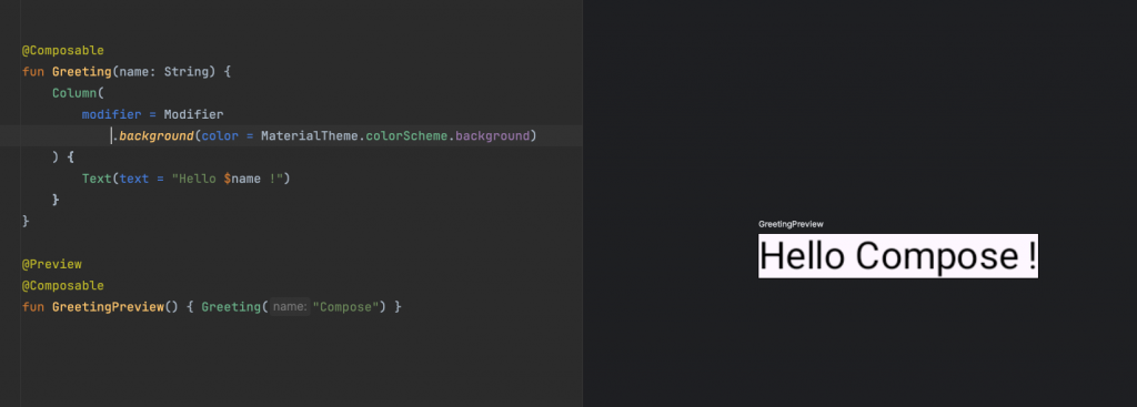
- When you want to preview it
you just create another function and add@Previewbefore it
this allows you to see the Compose preview in your IDE
// in ~/commonMain/

@Preview
@Composable
fun GreetingPreview() { Greeting("Compose") }
You can actually see the @Preview screen on the right side of the IDE
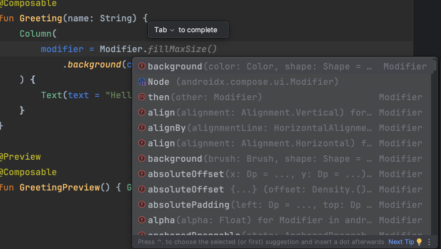
Modifier is a tool in
Composeused to modify and configure components
It provides various functions to change the behavior and appearance of Compose UI components
If you type in a Modifier
and then open it to see
you’ll find
it provides various options for setting UI behavior and appearance
such as backgroundcolor, align, height, width, onClick, etc.
there are many options - feel free to explore them:
- If you followed along yesterday to create the Theme
you can try using theMaterial3 themeto set component background colors
// in ~/commonMain/

@OptIn(KoinExperimentalAPI::class)
@Composable
@Preview
fun App() {
    //Set Material 3 theme using ElegantAccessComposeTheme
    ElegantAccessComposeTheme {
        Greeting("Compose")
    }
}
Then add a Column outside the Text like this
and use Modifier.background(color = MaterialTheme.colorScheme.background)
// in ~/commonMain/

@Composable
fun Greeting(name: String) {
    Column(
        modifier = Modifier
            .background(color = MaterialTheme.colorScheme.background)
    ) {
        Text(text = "Hello $name !")
    }
}
-
When developing apps for Android or iOS
you often need tocustomize the toolbar
-
We can create a reusable topbar like this
//in ~/commonMain/
@OptIn(ExperimentalMaterial3Api::class)
@Composable
fun MainAppBar(
  modifier: Modifier = Modifier,
  config: MainAppBarConfig,
  elevation: Dp = 4.dp,
  containerColor: Color = MaterialTheme.colorScheme.primaryContainer
) {
  CenterAlignedTopAppBar(
      title = config.title,
      colors = TopAppBarDefaults.mediumTopAppBarColors(
          containerColor = containerColor
      ),
      modifier = modifier.shadow(elevation = elevation),
      navigationIcon = {
          config.navigationIcon()
      },
      actions = {
          config.actionIcon?.invoke()
      }
  )
}
The core concepts here are:
- Using Compose’s native TopAppBar:
CenterAlignedTopAppBar - Considering that different screens may have different topbar content
we created a separate data classMainAppBarConfig
when using the topBar
you don’t need to rewrite the TopAppBar
just create an instance ofMainAppBarConfig - Frequently used variables are exposed
so they can be configured
for example:elevation
Implementing the data class
MainAppBarConfig
You can customize commonly adjusted items
like title length, title text, style, back button icon, etc.
// in ~/commonMain/

data class MainAppBarConfig(
    val marqueeNum: Int = 0,
    val titleText: @Composable () -> String = { "" },
    val title: @Composable () -> Unit = {
        DefaultTitleText(titleText(), marqueeNum)
    },
    val navigationIcon: @Composable () -> Unit = {},
    val actionIcon: @Composable (() -> Unit)? = null,
)

@OptIn(ExperimentalFoundationApi::class)
@Composable
fun DefaultTitleText(titleText: String, marqueeNum: Int) {
    Text(
        modifier = Modifier.basicMarquee(marqueeNum),
        text = titleText,
        style = MaterialTheme.typography.titleMedium,
        maxLines = 1,
        overflow = TextOverflow.Ellipsis,
        color = ExtendedTheme.colors.onAppBar
    )
}
- Here we’ll create the
createSettingfunction.
It uses theMainAppBarConfigwe created earlier
and inputs the content you want to configure
// in ~/commonMain/

private fun createSettingConfig(
    navController: NavController,
) = MainAppBarConfig(
    titleText = { stringResource(Res.string.title_setting) },
    navigationIcon = {
        NavBackIcon(navController = navController)
    },
)
Note: If you want to implement back button navigation functionality
you might need to pass in the navigation event to the function
However, using NavController is more flexible
NavController can manage all routes
you just need to specify the defined string when you need to navigate
Detailed explanations about this part will be provided in later chapters
- Practical usage ```kotlin // in ~/commonMain/
@Composable fun SettingScreen(navController: NavController) { val config = createSettingConfig(navController)
Scaffold(
    topBar = {
        MainAppBar(config = config)
    },
    containerColor = MaterialTheme.colorScheme.surfaceVariant
) {...} } ```
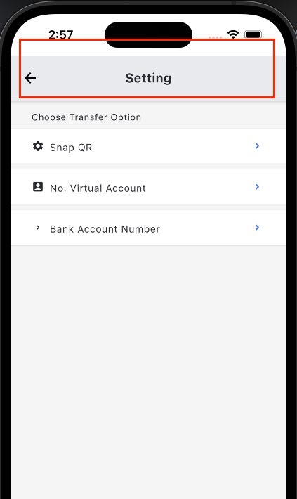
- Using the concepts above
we can easily implement a Settings page
// in ~/commonMain/

@Composable
fun SettingScreen(navController: NavController) {
    val config = createSettingConfig(navController)

    Scaffold(
        topBar = {
            MainAppBar(config = config)
        },
        containerColor = MaterialTheme.colorScheme.surfaceVariant
    ) { paddingValues ->
        LazyColumn(
            modifier = Modifier
                .fillMaxSize()
                .padding(paddingValues),
            verticalArrangement = Arrangement.spacedBy(8.dp)
        ) {
            item {
                Text(
                    "Choose Transfer Option",
                    style = MaterialTheme.typography.bodySmall,
                    modifier = Modifier.padding(start = 30.dp, top = 16.dp, end = 30.dp)
                )
            }

            items(SettingOption.values()) { option ->
                SettingOptionCard(
                    option = option,
                    onClick = {
                        navController.navigate(option.route) {
                            navController.graph.startDestinationRoute?.let {
                                popUpTo(it) {
                                    saveState = true
                                }
                            }
                            launchSingleTop = true
                            restoreState = true
                        }
                    }
                )
            }
        }
    }
}